


Welcome. This is GH
Welcome. This is GH
CI
Symbolic Representation
CI is based on the English acronym, ‘GH,’ combined in a cube shape stressing the corporation’s role of building new urban spaces in order to present the urban value of Gyeonggi-do. It contains the value that the corporation pursues in order to deliver happiness and harmony throughout the region together with the residents as it is symbolized by ‘G’ representing Gyeonggi-do and ‘H’ standing for urban housing.
Name of Corporation
Founded in 1997 under the name of the Gyeonggi Innovation Corporation, the corporation changed its name to Gyeonggi Urban Innovation Corporation in 2007 and then, 13 years later, to the Gyeonggi Housing & Urban Development Corporation in 2020. By specifying ‘Housing’ in its new name, the corporation clearly announced its will to enhance its role of addressing housing issues within the region of Gyeonggi by expanding its business venues to housing site development projects rather than merely engaging in development projects only.
Dedicated Colors
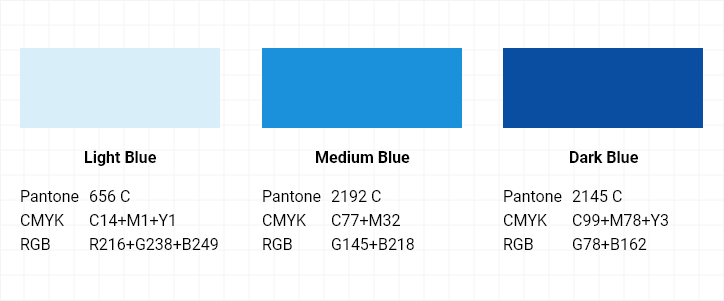
To express its value of trust and elegant urban image, the corporation intends to demonstrate its future vision of taking the next step forward through blue colors in two different tones.
BI
Symbol Mark
Logo Mark
Dedicated Colors
The original ‘Nature&’ and glimmer ‘Nature&’ are logo marks of ‘Nature&’ with their own distinctions depending on the brightness of the background colors. When the brightness of the background color for the logo mark is calculated as K value (gray scale), the original ‘Nature&’ will be used in cases where K is 0% or higher and less than 60%, and the glimmer ‘Nature&’ will be employed in cases where K is between 60% and 100%. Thus, the glimmer ‘Nature&’ cannot be displayed on top of bright background where K is less than 40%.